
The performance of a stock portfolio does not rely on luck, but on the ability to make the right choices at the right time. To achieve this, intuition is not enough: it is imperative to have reliable, complete and above all immediately readable financial data.
⚡️ In short: What to remember about Moning
✅ WE APPROVE
- 10 years of history in the free version : Full access to price and dividend charts over a decade (rare among competitors).
- Safety & growth scores : A proprietary rating system to immediately identify solid stocks and avoid pitfalls.
- Hybrid analysis (AI + expert) : AI-generated explanations to understand the figures, complemented by the opinion of an AMF-certified analyst.
- Centralized management : Global tracking of your brokerage, Crypto and tokenized real estate like RealT in the same place.
❌ WHAT WE LIKE LESS
- No real-time data : Prices are updated every 24 hours.
- Synchronization sometimes unstable : Like all aggregators, the connection depends on the cooperation of brokers and may require occasional manual input.
For a long time, the retail investor made do with Excel files. But this method quickly shows its limits: time-consuming manual updates, a static interface and a total inability to evaluate the intrinsic quality of assets. It’s an accounting tool, not a decision-making tool.
This is where Moning comes in. The platform stands out because of its duality: it allows you both to manage your current wealth (a consolidated view of the present) and to identify future investment opportunities thanks to a powerful Screener.
But is the tool robust enough to become your stock portfolio management tool? In this full review, we will analyze all the features, from stock research to the new AI risk analysis, to determine whether Moning is the solution you need for 2026.
Moning: Presentation of the wealth management platform
Moning is not only a powerful Screener; above all, it’s a portfolio tracking platform (Portfolio Tracker) designed to centralize your entire financial wealth. It is essential to note that it is not a broker: you do not place orders here, you analyze your positions.
To aggregate your data, the tool offers a twofold approach. Automatic synchronization connects your bank and investment accounts for near real-time tracking. However, manual entry remains a key feature, often preferred by demanding users. It not only compensates for connection instabilities with some brokers, but above all allows you to include custom assets like physical real estate or collectible watches.
This flexibility lets you calculate an accurate overall Net Worth, encompassing your Stocks, ETFs and Cryptocurrencies. Available in French, English, German and Spanish, the interface differs from trading tools: it is entirely dedicated to fundamental analysis. Moning highlights the structuring financial data (Balance Sheets, Dividends, Valuation) to support a long-term investment strategy.
The Moning interface: Overview and key features
The user experience on Moning begins with a homepage designed as a true control dashboard. Far from being a simple list of numbers, this interface is structured to offer three immediate layers of reading: the portfolio’s financial health, the global economic context and community interaction.
Performance indicators (KPIs) and proprietary scores
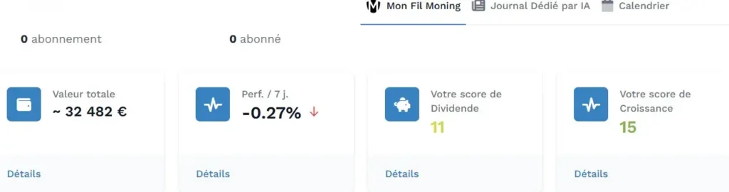
Upon login, the top banner displays four essential cards that summarize the investor’s situation. The first two are classic but indispensable: the Total Value of the wealth (aggregated from all connected or manually entered accounts) and the 7-day Performance. The latter acts as a short-term trend indicator, allowing you to see whether the portfolio is outperforming or underperforming the market over the past week.
However, the real strength of the tool lies in the next two cards, which display Moning’s exclusive algorithmic ratings:
- The dividend score : Rated out of 20, this indicator is the guardian of your financial security. It analyzes the ability of companies in the portfolio to maintain their payouts. Calculated based on strict ratios like the Payout Ratio and debt levels, a high score immediately reassures about the sustainability of your future income.
- The growth score : This second rating evaluates the dynamics of the held assets. It examines the historical evolution of Revenue and Earnings Per Share. It’s a valuable indicator to avoid “yield traps” and ensure you invest in companies that create long-term value.
Market information: News feed, AI and calendar
The central part of the screen is dedicated to information, intelligently segmented so as not to drown the user in the continuous flow of financial markets.
- The Moning feed: This news feed, titled “Market Briefing”, offers a global view. It does not focus specifically on your holdings, but deciphers the general economic environment: global market trends, changes in interest rates, inflation or geopolitical tensions. It’s the day’s economic “weather”, essential for putting decisions into context.
- The AI-dedicated journal : Accessible via a dedicated tab, this feature uses artificial intelligence to perform a drastic triage. The AI scans thousands of articles to retain only those that concern your companies. Processing may take a few moments (indicated by a loading message), proof that the analysis is generated in real time to provide a tailored press review.
- The Market Calendar : A planning tool par excellence, it centralizes the critical events for your portfolio and watchlist. This is where the investor anticipates cash flows (ex-dividend dates) and monitors the health of assets (earnings release dates and Annual General Meetings).
The community and investor support
Finally, the right sidebar reminds you that Moning is also a social platform. Investing can be a solitary activity, and this space aims to break that isolation via two levers:
- The forum : Direct access to recent community discussions. It’s a place for mutual help to solve technical questions, debate the analysis of a specific stock or share feedback.
- Public portfolios : The tool lets you discover and follow portfolios shared by other European investors. This “social tracking” feature is a major source of inspiration, allowing you to compare your strategy with those of other successful members and discover new investment ideas.
Central dashboard: Performance management and allocation
Beyond the homepage, the heart of the engine is the “Dashboard” tab. This is where data aggregation makes all the sense, offering a consolidated view of your wealth, whether invested in stocks, real estate or peer-to-peer loans.
Financial summary and performance chart
The top section of the screen displays the “Top of Balance”, focused on three decisive metrics for the income investor:
- Total dividend yield : The gross performance of your positions.
- Total value : The sum of all your assets in real time.
- Total annual dividends : The most motivating figure. It projects the total amount you will receive during the year, acting as a compass for your income objectives.
Just below, the main chart compares the evolution of the portfolio value (blue area) to the amount invested (red line). The gap between the two materializes your unrealized capital gains.
⚠️ Important point to watch (The Red Line) : It is crucial for new investors to understand the behavior of the red line (“Amount invested”). It represents the purchase value of the positions currently held in the portfolio, not the historical cumulative money invested. Concretely: If you sell a stock with a large gain and immediately buy another, the red line will “jump” to align with the purchase price of the new stock. The realized profit is crystallized and reinvested, which can visually give the impression that your margin of safety disappears. It’s a logical accounting mechanism, but one to keep in mind when rebalancing.
Strategic allocation, diversification and analysis tools
Moning demonstrates its flexibility here by managing multi-asset portfolios perfectly. The system is not limited to the stock market: it also allows you to integrate alternative assets like Crowdlending. But its great strength lies in specific support for tokenized real estate via the blockchain.
Concretely, if you invest on RealT (see my full review of the platform), Moning can scan your public Wallet (Gnosis/Ethereum address) directly. It then automatically imports all your tokenized properties without you having to enter them one by one.
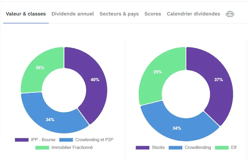
To analyze this distribution, the right panel offers several visual analysis tabs:
- Value & classes : Interactive pie charts to check the balance between your pockets (e.g., 40% Stocks vs 26% Real Estate).
- Annual dividend : To see which asset contributes most to your income.
- Sectors & countries : Essential to avoid putting everything on a single geographic area or sector.
- Scores : An overview of the quality of your holdings according to Moning criteria. Small important note : this rating system applies only to individual stocks (stock picking). ETFs, due to their diversified structure, unfortunately do not benefit from these scores yet.
- Dividend calendar : This tab displays a bar chart of upcoming payments month by month. It’s a valuable cash management tool to anticipate big income months and quieter months.
Multi-portfolio management and AI audit (Moning Bot)
At the bottom of the page, the portfolio-by-portfolio breakdown allows you to track the performance of each strategy or separate by asset type: Stocks, Crowdlending, crypto. You can instantly compare dividend yield and total return.
Finally, the major innovation hides behind the small robot icon 🤖 : the Moning Bot. Much more than a simple gimmick, it’s an automated wealth auditor. In one click, the AI analyzes the structural composition of your investments to provide a report worthy of a financial advisor.
Based on your real portfolio, the Bot is capable of :
- Validating your diversification : It detects your main axes (Stocks, Real Estate, P2P) and validates risk distribution.
- Identifying concentration risks : It will alert you, for example, to very high exposure or a geographic risk.
- Highlighting strengths and weaknesses : It brings to light the performance drivers or points of concern.
- Giving strategic advice : It can suggest monitoring a cash pocket or rebalancing certain sectors.
⚠️ Important note : Never forget that the Moning Bot remains a decision support tool and not a decision maker. Its primary usefulness is to highlight points of vigilance you might have missed and to challenge certain assumptions in your strategy. However, the algorithm does not know your life, your projects, nor your assets located outside Moning. You should therefore not follow it blindly, but use its reports to refine your own judgment.
Deep analysis and portfolio-level management
When you click on a specific portfolio (your main account or a secondary pocket), the interface changes to offer a surgical view of that envelope.
This is personally the window where I spend most of my time (just after the Community Forum) to manage my strategy. As the saying goes: “You can only improve what you measure”. It is therefore necessary to take time here to understand the evolution of your wealth, analyze your choices and adjust if necessary.
Profitability indicators and health diagnosis
The top banner acts like a fund manager’s dashboard. It presents four fundamental metrics:

- Total value : The current portfolio balance with its variation (unrealized gain) shown in green. Let’s be honest: it’s always pleasing for morale to see this value increase over the long term, validating the consistency of savings.
- Total annual dividends : The sum of the incomes generated by this portfolio. It’s the real nerve center. Beyond the number, you should see this indicator as a future replacement salary. It’s the amount that, year after year, will gradually replace your earned income to achieve financial freedom.
- Total dividend yield : The current gross yield relative to market price.
- Yield on amount invested (YoC) : A crucial technical metric. It compares your current dividends to your initial purchase price. If you are patient, this figure becomes much higher than the market yield. It’s a visual reward: a concrete way to see that the efforts have paid off and to measure the long journey since your first investments.
Projection and verification tools (Back-test)
This menu gives access to powerful tabs to validate past and future choices:
- Dividend projection : The ultimate motivational tool. It simulates the future of your income over 10 or 20 years. Seeing the blue bars soar allows you to concretely visualize the compound effect.
- The Back-test : Did you beat the market? This tool compares your historical performance against the S&P 500 or a global index.
⚠️ Important reminder : This tool is based only on the past to say whether you would have beaten the market with this strategy. It is useful to verify the consistency of your choices, but never forget that past performance does not predict the future.
- Dividend calendar : This tab simply displays, in chart form, the amounts you will receive month by month for this account. It’s a simple reading tool to know your upcoming cash inflows.
Detailed analysis of a position (The Asset Line)

The core of management happens in the Positions tab. This is where Moning shines with its clarity. Rather than having to open each company’s sheet, the table condenses all vital information on a single line.
Let’s take the example of an ETF line visible in the image to understand the wealth of data displayed at a glance:
- Identity and quantity : On the right, you have your number of shares and their valuation.
- Performance (Avg. purchase price vs return) : You immediately see your purchase price against your unrealized gain. It’s the immediate indicator of success or failure of the line.
- Income (annual div.) : The column shows how much this specific line pays you per year.
- Trend (price / 1 year) : A very useful contextual data point that shows the stock’s dynamics over the last 12 months.
- The scores : If it’s a direct stock (like Total Energies or Coca-Cola), the Safety and Growth ratings will appear here. (Note that for an ETF, these fields are logically empty).
Finally, at the very bottom of the table, several sharp indicators allow you to instantly understand the distribution of your capital. A series of tabs lets you switch the display to analyze your portfolio from all angles: Sectors, Countries, Market caps or even Currencies.
Among these options, I particularly like the stock map (Treemap). It’s my favorite display for managing weighting. Rather than abstract lists, your assets appear as nested rectangles whose size is proportional to their real weight. It’s an extremely effective way to see at a glance if a position visually “overwhelms” the rest of the portfolio, greatly facilitating the decision to rebalance your lines.
Knowing how to manage your existing portfolio is essential, but it’s another thing to know how to fill it intelligently. How to choose future positions among thousands of listed companies? Does Moning offer a solution? The answer is yes, thanks to a formidable tool: the Stock Screener, which we will dissect together.
Connecting your investments: Automatic or manual synchronization?
Once your account is created, your positions are empty. For the magic to happen, you need to feed Moning with your data. The platform offers you two schools: total automation or manual control.
Automatic Synchronization (Time saver)
This is the most popular feature to avoid the chore of entry. Moning relies on recognized third-party banking aggregators (DSP2-authorized partners) to connect to your brokers and retrieve your positions.
- The principle : You enter your credentials via the partner’s secure interface, and Moning retrieves the list of your stocks and their cost basis.
- The reality on the ground : We must be transparent on this point. If synchronization is “magical” when it works, it remains dependent on the willingness of financial institutions. It often happens that a bank or broker updates its website or tightens its security. Result? The technical “bridge” is cut. Synchronization can then become unusable for a few days, even several weeks, while technical teams update the connector. This is an inherent hazard for all wealth aggregators, not just Moning.
Manual Management (Total reliability)
Faced with the whims of technology, the manual method remains a safe choice. It is in fact favored by investors who want absolute control or who use “exotic” brokers not supported by European aggregators.
The process is simple: you search for the stock in the search bar and enter: “I bought 10 shares at €150”. The major advantage is stability: your data will never change unless you decide to modify it. You will not depend on any external technical update.
Data security and privacy
The blocking question is often: “Is it risky to connect my bank?”.
The answer is no, for a simple technical reason: access is Read-Only. Concretely, Moning (and its partners) can only view what is in the account to create charts. They technically have no power to place buy/sell orders or make external transfers. Your funds therefore remain safe with your broker; Moning is only a viewing window.
The stock screener: Finding the best market opportunities
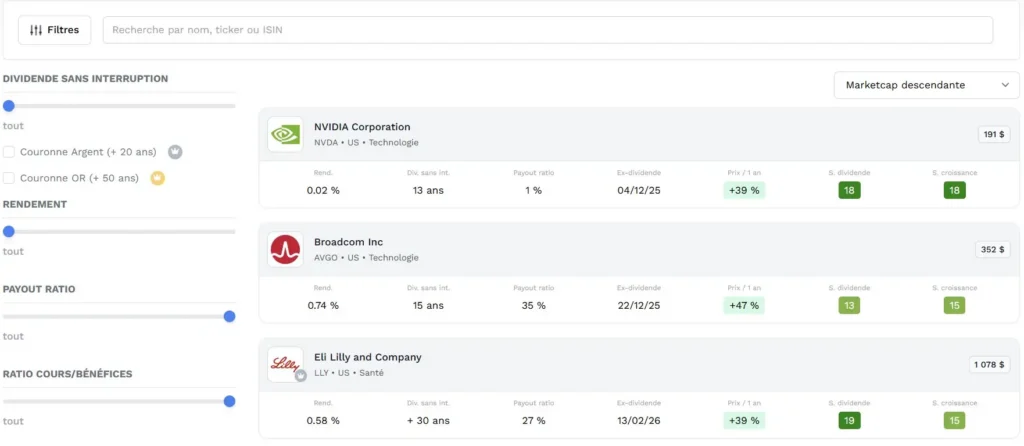
Simplifying complexity: The power of filters
When you start in the stock market, the problem is not lack of information, but overload. Payout Ratio, P/E, Debt, Free Cash Flow… There are so many parameters and metrics that you often don’t know where to look or which value to prioritize.
This is where the Moning Screener stands out. Rather than leaving you alone with indigestible Excel tables, it offers intelligent filters that already condense complex fundamental analysis. The goal is to let you define your “investment universe” in a few clicks, whether you are looking for immediate income or future growth.
Note that there are two offers on Moning. The Free offer is already very complete and allows powerful sorting. The Premium offer (marked with stars ⭐️ below) goes even further for demanding investors who want to fine-tune their strategy to the millimeter.
The selection criteria at your disposal
The search engine allows you to filter the market according to several major families of criteria:
- Dividend history (company reliability) : You can filter companies that have never cut their payment, or target the market aristocracy with silver crowns (+20 years without a cut) and gold crowns (+50 years without a cut).
- Financial fundamentals : The classics are there: Yield, Payout Ratio (to avoid unfunded dividends) and the Price/Earnings ratio (P/E).
- Moning scores (⭐️ Premium) : This is the major added value. You can filter directly by Safety Score or Growth Score. It’s a phenomenal time-saver to instantly eliminate fragile companies.
- Dividend growth (⭐️ Premium) : To target companies that have rapidly increased their dividend over the last 5 years.
- Payment frequency (⭐️ Premium) : Ideal for those building a monthly passive income. You can isolate stocks that pay Monthly (x12), Quarterly, etc.
- Valuation and advice (⭐️ Premium) : A powerful filter allows you to retain only stocks considered Undervalued (buy zone) or those benefiting from a Advisor Comment.
- Sectors and geography : Of course, you can restrict the search by sector (Health, Tech, Real Estate, ETFs…) or by country and tax eligibility.
Analysis of results and method (my advice)
Once filters are applied, the results table is displayed.
Personally, I’d like to share a usage tip from my experience: don’t always sort your results by the highest yield. It’s the natural reflex of a beginner, but often the best way to fall into “yield traps” (companies in trouble showing a high % because their price has collapsed).
I prefer to sort results by the best Safety Score. This brings the most solid companies to the top of the list. Then I look at the yield they offer. This approach allows you to build a far more resilient portfolio over the long term.
Finally, keep in mind that the Screener is a pre-selection tool. A stock that tops the list should not be bought with your eyes closed. It’s an invitation to consult its Stock Sheet for a detailed review to confirm your choice.
Fundamental analysis: A 360° view over 10 years
The immediate diagnosis: safety and growth scores
Upon opening the stock sheet, the top banner centralizes the essential market data. Beyond the share price and current yield, the analysis relies on two proprietary indicators calculated by the Moning algorithm:
- The dividend safety score : This indicator is fundamental to assess the company’s financial health. It weights key ratios such as the payout ratio and debt level to estimate dividend reliability. A high score indicates the company generates enough cash flow to cover its payments, thus reducing the risk of a dividend cut.
- The growth score : This second indicator measures the company’s long-term momentum. It analyzes the evolution of Revenue and Earnings Per Share (EPS) over several years. For the investor, it’s a crucial filter to identify expanding companies and avoid those whose activity is stagnant or declining, thus ensuring a potential for capital appreciation.
My daily use (Selection filter) : In a stock-picking strategy, these scores act as a first fundamental analysis filter. A low safety score (red/orange color code) is an immediate warning signal about the sustainability of the yield. Conversely, high scores (green color code) validate the intrinsic quality of the case and justify in-depth study of the financial statements.
Historical and graphical analysis over 10 years: Market depth
This is a major competitive advantage of Moning. While most free market tools restrict access to 3 or 5 years of data, Moning unlocks 10 years of financial history. This depth is critical for fundamental analysis: it allows you to assess a stock’s behavior over a complete economic cycle, including crisis and boom phases, so as not to bias your judgment by recent volatility.
The interface offers essential visualization tools for market timing:
- The long-term price chart : The issue : Identify the underlying trend (secular trend) of the asset. This helps smooth out short-term market “noise” to validate the regularity of the stock’s growth.
- Valuation history (P/E) : The issue : Buy at the right price. This chart compares the current Price Earnings Ratio to its recent average. It helps spot whether the stock is statistically undervalued (opportunity) or in a speculative bubble compared to its standards.
- Regression (trend channel) : This is probably the decision support tool I consult most for my entry points. The dotted lines represent a statistical regression channel.
- If the price touches the bottom of the channel, the stock is technically oversold: it’s often a strong buy signal.
- If it breaks the ceiling, the stock is overheated: caution is advised (risk of correction).
- Market comparison (Benchmarking) : The issue : Measure the opportunity cost. This tool overlays your stock’s performance against a reference index like the S&P 500 (SPY). It answers a crucial portfolio management question: is this company generating Alpha (outperformance) or would you be better off buying a simple index ETF?
- Theoretical fair value : The issue : Visualize the margin of safety. This pedagogical chart defines colored zones of undervaluation (green) and overvaluation (yellow) based on Moning’s valuation models. It’s an immediate visual indicator to know if the current price offers appreciation potential.
- Evolution of the number of shares : The issue: Monitor your slice of the pie. This chart is often neglected by beginners, yet it is crucial. It shows whether the company issues new shares (which dilutes your stake and lowers the value of your holdings) or buys back its own shares (Share Buybacks).
⚠️ A downward curve is an extremely positive signal (the releverage phenomenon). The company uses its cash to reduce the number of shares outstanding, which mechanically increases Earnings Per Share (EPS) and the value of each remaining share in your portfolio without you having to invest another cent.
The alliance of artificial intelligence and human expertise
Having raw data is good. Understanding it is better. To prevent the investor from drowning in numbers, Moning deploys a dual layer of analysis: the computing power of AI and the nuance of human judgment.
1. Contextual AI: making the charts “speak”
Moning does not just display curves. A powerful feature, often ignored by beginners, provides an instant textual interpretation of each chart.
By simply clicking on a table (such as revenue growth or EPS), the artificial intelligence generates a detailed report to explain what you are looking at. Far from a robotic summary, the AI structures its reasoning like a financial analyst:
- Historical analysis : It deciphers phases of stable growth and identifies anomalies (e.g., why a sudden drop in 2020 or an exceptional rebound in 2021?).
- Projection : It analyzes future estimates to see whether the trend will continue or fade.
- Strategic conclusion : The most important for you. The AI tells you whether the company shows signs of maturity (growth slowing but a robust model) or if it is in full expansion. It even gives you the points of vigilance to watch (ability to innovate, diversification, margin preservation) for long-term investment.
2. The insight of a certified expert
Because an algorithm will never completely replace human intuition, Moning includes on many stock sheets an analysis written by an expert.
These are not anonymous forum opinions, but analyses signed by Clément Hourseau, an experienced investor holding the French certification from the Autorité des Marchés Financiers (AMF).
It’s an invaluable mark of seriousness. Where AI processes cold data, Clément brings nuance, macroeconomic context and a qualitative vision of the company’s situation. Having access to this type of analysis directly in your management platform is a major asset for securing your decision-making.
My final opinion on Moning: The ultimate tool for the income investor?
After dissecting the platform from top to bottom, it’s time to deliver the verdict. Moning has succeeded in making fundamental analysis accessible without making it simplistic.
Strengths and limitations
What I particularly appreciate (Pluses) :
- Historical depth : Having access to 10 years of data (Prices, Dividends, charts) in the free version is a real competitive advantage.
- The “All-in-one” approach : Being able to follow brokerage accounts, your tokenized real estate like RealT and cryptocurrencies in one place drastically simplifies wealth management.
- Pedagogy : The Scores (Safety/Growth) and AI explanations allow you to make informed decisions without being an accounting expert.
What can be a drawback (Minuses) :
- Update frequency : Market data is refreshed about once every 24 hours. That’s sufficient for an investor, but frustrating for those who like to follow their wealth minute by minute.
- Scores absent on ETFs : As noted earlier, the rating system is excellent for individual stocks but does not (yet) apply to index funds.
- Synchronization : Like all market aggregators, the bank connection depends on brokers’ cooperation. Sometimes they change their IT system, making synchronization unusable for a time until the connector is updated.
Who is this tool for?
The answer follows directly from the previous point on data updates.
Moning is tailored for the long-term investor (profile “steady family investor”, FIRE, Income). Someone who buys to hold for years and needs a macroscopic view of growth and future dividends.
Conversely, this tool is absolutely not suited for Traders. If you do intraday technical analysis or Scalping, move on. With daily price updates, Moning is a strategic management tool, not a trading cockpit.
The Verdict: Free or Premium?
It’s often the annoying question, but here the answer is simple: the Free offer is remarkably generous. It does not restrict the essentials: you have access to 10 years of history, synchronization and unlimited portfolio tracking. For 90% of retail investors, the free version will be more than enough to steer their financial freedom.
The Premium offer (Moning Pro) is a comfort accelerator for demanding enthusiasts. It unlocks the advanced Screener filters (the famous stars), access to expert opinions. It’s a nice bonus to support the tool’s development, but by no means a mandatory toll to manage your money well.
Moning has become my daily dashboard. It’s a reliable companion that refocuses attention on what really matters: the sustainable growth of your passive income.
FAQ
Yes, the free offer is very generous. It allows you to track a portfolio of unlimited size and to access 10 years of financial history on stocks. The Premium (Pro) version is optional and is mainly for investors who want very advanced filtering tools.
Absolutely. Moning uses authorized third-party aggregators (as used by banking apps) that connect in “Read-Only” mode. Concretely, the platform can see your positions to create charts, but cannot technically make transfers or place orders.
Moning is not a broker. You cannot buy stocks directly on it. It is a tool for visualization and analysis that plugs into your existing brokers to give you a clear overview and decision support tools.
Leave a Reply